# load the dataset here
df <- read_csv('data.csv', show_col_types = FALSE)Introduction
For my MSc Statistical Inference module, I completed the following assignment. The brief was:
- The head of school for a four year degree course has provided you with some data based on student demographics, marks and graduate outcomes. They have asked you if the data could reveal findings that may be relevant to them.
My grade for this assignment was 90%.
Data structure
- ID – a unique student identifier issued to each student at the start of the course
- pment – an indicator of whether student completed an industrial work experience placement year, 1=YES, 2=NO
- gender – gender (at start of course)
- age – age (at start of course)
- language - score given for level of English proficiency at the start of the course (out of 10)
- feedback - score given for satisfaction of course at the end of Year 4 (out of 10)
- Year1 - Mark for Year 1
- Year2 - Mark for Year 2
- Year3 - Mark for Year 3
- Year4 - Mark for Year 4
- employ - employment status one year after finishing course (E1 = employed, E2 = in full time further education, U = not yet employed, missing = status unknown)
Data Preparation
Confirming data quality
I will firstly check and validate the key variables that the metadata indicates I should expect.
df %>%
  assert(in_set("Male", "Female"), gender) %>% #assert that gender is either male or female
  assert(within_bounds(0, 100), Year1, Year2, Year3, Year4) %>% #assert that marks per year are between 0 and 100
  assert(within_bounds(1, 10), language, feedback) %>% #assert that language and feedback scales are between 1 and 10
  summary()
ID gender age pment
Min. :11329 Length:60 Min. : 18.00 Min. :1.00
1st Qu.:33016 Class :character 1st Qu.: 18.00 1st Qu.:2.00
Median :64153 Mode :character Median : 18.00 Median :2.00
Mean :59350 Mean : 52.35 Mean :1.86
3rd Qu.:86030 3rd Qu.: 19.00 3rd Qu.:2.00
Max. :98358 Max. :2000.00 Max. :2.00
NA's :10
language feedback Year1 Year2 Year3
Min. :3.000 Min. :5 Min. :61.00 Min. :58.00 Min. :78.00
1st Qu.:5.000 1st Qu.:6 1st Qu.:64.00 1st Qu.:59.75 1st Qu.:80.00
Median :5.000 Median :7 Median :65.00 Median :61.00 Median :81.00
Mean :5.545 Mean :7 Mean :65.15 Mean :61.12 Mean :81.40
3rd Qu.:6.000 3rd Qu.:8 3rd Qu.:67.00 3rd Qu.:63.00 3rd Qu.:82.25
Max. :8.000 Max. :9 Max. :68.00 Max. :66.00 Max. :87.00
NA's :5 NA's :6 NA's :12
Year4 employ
Min. :70.00 Length:60
1st Qu.:73.00 Class :character
Median :74.00 Mode :character
Mean :74.18
3rd Qu.:75.00
Max. :80.00
NA's :11 Understanding the dataset and its structure
# further data preparation here
#str(df) #check structure and data types
In looking at the structure of the data, I can see that two categorical variables are stored as strings; there is also one categorical variable, pment, stored as doubles. All numerical variables are stored as doubles. I will convert the nominal categorical variables to factors, to ensure that they are treated correctly if included in later statistical models (Tüzen, 2024).
df <- df %>%
  mutate( #transform gender, pment and employ variables to factors
    gender = factor(gender),
    pment = factor(pment),
    employ = factor(employ)
  )
I will also use the janitor library to clean the variable names, to ensure consistency and follow best practice.
df <- clean_names(df) #auto-clean variablesI will next view a table of summary statistics, to get an overall sense of the characteristics of the dataset, including its spread and any potential outliers.
summary(df) #view summary statistics id gender age pment language
Min. :11329 Female:41 Min. : 18.00 1 : 7 Min. :3.000
1st Qu.:33016 Male :19 1st Qu.: 18.00 2 :43 1st Qu.:5.000
Median :64153 Median : 18.00 NA's:10 Median :5.000
Mean :59350 Mean : 52.35 Mean :5.545
3rd Qu.:86030 3rd Qu.: 19.00 3rd Qu.:6.000
Max. :98358 Max. :2000.00 Max. :8.000
NA's :5
feedback year1 year2 year3 year4
Min. :5 Min. :61.00 Min. :58.00 Min. :78.00 Min. :70.00
1st Qu.:6 1st Qu.:64.00 1st Qu.:59.75 1st Qu.:80.00 1st Qu.:73.00
Median :7 Median :65.00 Median :61.00 Median :81.00 Median :74.00
Mean :7 Mean :65.15 Mean :61.12 Mean :81.40 Mean :74.18
3rd Qu.:8 3rd Qu.:67.00 3rd Qu.:63.00 3rd Qu.:82.25 3rd Qu.:75.00
Max. :9 Max. :68.00 Max. :66.00 Max. :87.00 Max. :80.00
NA's :6 NA's :12 NA's :11
employ
E1 : 9
E2 : 8
Missing:13
U :30
From the summary table, and with consideration to the research questions, I note that:
- The sample size is relatively small (n = 60). I may need to take this into account when answering the research questions.
- There is an uneven split between the genders in this dataset, with females represented twice as much as males.
- There is at least one outlier (an invalid value: 2000) in the age variable.
- There is some missing data that I will need to take into account.
- At a first glance, marks seem to have decreased from Year 3 (x̄ = 81.40) to Year 4 (x̄ = 74.18).
- Marks for each of the four years all seem to be normally distributed, with means close to medians.
- There is a value,
missing, in the employ variable, which would be handled better as NA.
Cleaning the age variable
The summary table shows that there is at least one value in age that needs to be dealt with. First I will check for other outliers by printing all unique values.
sort(unique(df$age)) #view all age values in order[1] 18 19 20 22 29 34 35 2000The table of unique values confirms that there is an invalid value, which appears to be the only extreme outlier in this variable. It is possible that this should be 20, as that is another value within the dataset, but as I cannot be sure I will change it to NA.
df$age[df$age > 100] <- NA #change values over 100 to NAI chose to change the outlier to NA rather than remove it, in line with reproducibility standards. This preserves the rest of the data in that observation and I will still be able to analyse age using functions where na.rm = TRUE is an option.
Next, I will make a boxplot to visualise the distribution and central tendency of the age variable.
ggplot(df, aes(y = age)) +
  geom_boxplot(outlier.colour = "red", #make boxplot with outliers shown in red
               na.rm = TRUE,
               outlier.shape = 16) +
  theme_minimal() +
  theme(plot.margin = margin(t = 10, r = 20, b = 10, l = 20),
                             plot.title = element_text(size = 14, #add a title to the boxplot
                                  face = "bold",
                                  margin = margin(t = 5, b = 20))) +
  coord_flip() + #flip the plot to landscape for better visability
  labs(title = "Boxplot for age", #label the plot and its axes
       x = "",
       y = "Age")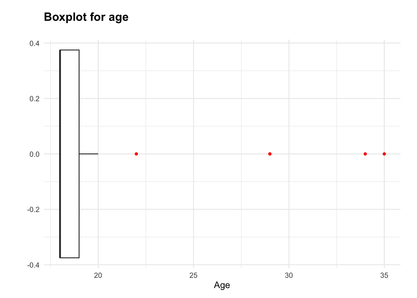
The age data is positively skewed (skewness = 3.43), with most values clustered around 18 and 19, and some mature students lengthening the upper tail. I will make a frequency table to confirm whether this is caused by a small number of higher ages, as the boxplot suggests.
table(df$age) #check frequencies of age values
18 19 20 22 29 34 35
38 12  4  1  2  1  1
The frequency table shows that there are several low-frequency values in the age variable. Knowing that age may be included in later analyses, I will group ages 20 and above into one category. This approach will help protect the validity of future tests and models; multiple low-frequency groups in this context would represent too small a sample size for each value to draw meaningful conclusions. Simultaneously, this protects the distinction between the two most frequent ages, 18 and 19, which account for the majority of the dataset.
df <- df %>%
  mutate(
    age_combined = case_when( #make a new variable called age_combined
      age <= 19 ~ as.character(age), #get ages 18 and 19 (as strings so output types match)
      age > 19 ~ "20+" #combine all higher ages into 20+
    ),
    age_combined = factor(age_combined, levels = c(as.character(18:19), "20+")) #make into factor
  )

#code adapted from Ebner (2021)
Another frequency table will confirm the structure of the new variable, age_combined.
table(df$age_combined) #view frequency table of ages after grouping
 18  19 20+
 38  12   9
Cleaning the employ variable
I will reassign the Missing value in the employ variable to avoid it being included as valid during analysis. If it was treated as a meaningful category of employment status, any resulting analysis would likely be biased or inaccurate; as such, I will change it to NA.
df$employ[df$employ == "Missing"] <- NA #reassign "missing"Handling missing data
I am aware from the summary statistics table that there are some missing values. I will calculate the proportion of the variables that are NA, in order to decide how to deal with them.
round(colMeans(is.na(df)) * 100, 2) #check percentage of missing values id gender age pment language feedback
0.00 0.00 1.67 16.67 8.33 10.00
year1 year2 year3 year4 employ age_combined
0.00 0.00 20.00 18.33 21.67 1.67 In line with guidance provided, I have chosen not to apply any transformations or imputation to handle missing values. Later analyses and models (ANOVA or linear regression, for example) will automatically exclude rows with NAs due to defaults such as na.action = na.omit. That said, it is important to acknowledge the limitations of this approach, as exclusion of missing values can affect accuracy through introducing skew or bias (Kaur, 2025). I will bear this mind as I progress to the research questions, especially for year3, year4 and employ as these are all missing around 1/5 of their values.
Research Question 1: Are there any differences between the genders for the Year 4 marks awarded and the Year 3 marks awarded?
Exploratory Data Analysis
Checking hypothesis test assumptions
#make two histograms - to visually check normality of year3 and year4 respectively

#plot year3, change colours, add labels
ggplot(df, aes(x = year3)) +
  geom_histogram(binwidth = 1,
                 fill="#404080",
                 color="#e9ecef",
                 alpha=0.6,
                 na.rm = TRUE) +
                 aes(y = after_stat(density)) + #add density line to help visualise shape of distribution
  geom_density(na.rm = TRUE, linewidth = 0.25) +
  theme_minimal() +
  theme(plot.title = element_text(size = 14,
                                  face = "bold",
                                  margin = margin(t = 5, b = 20))) +
  labs(title = "Distribution of marks for Year 3",
       x = "Marks",
       y = " ")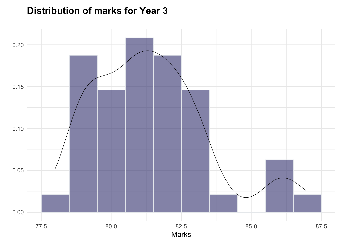
#plot year4, change colours, add labels
ggplot(df, aes(x = year4)) +
  geom_histogram(binwidth = 1,
                 fill="#404080",
                 color="#e9ecef",
                 alpha=0.6,
                 na.rm = TRUE) +
                 aes(y = after_stat(density)) + #add density line to help visualise shape of distribution
  geom_density(na.rm = TRUE, linewidth = 0.25) +
  theme_minimal() +
  theme(plot.title = element_text(size = 14,
                                  face = "bold",
                                  margin = margin(t = 5, b = 20))) +
  labs(title = "Distribution of marks for Year 4",
       x = "Marks",
       y = " ")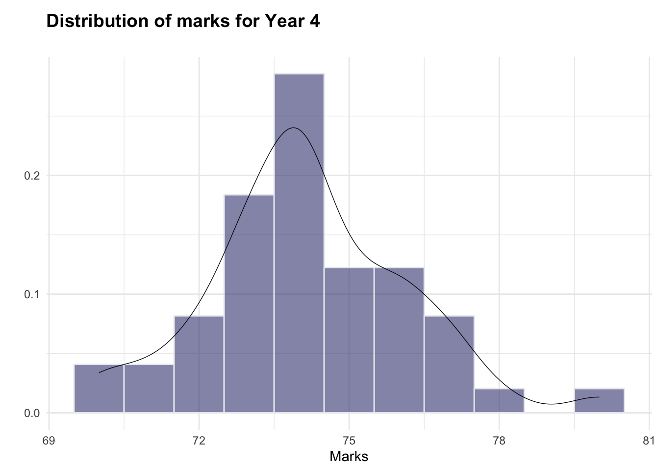
The histograms indicate that both year3 and year4 are roughly normally distributed (although there appear to be a small number of higher-scoring students, particularly in year3, which could warrant further investigation). As such, the normality assumption for the hypothesis test is adhered to.
Pivoting marks data
I will create a separate pivoted dataframe, to enable visualisation of marks by both year and gender.
piv_df <- df %>%
  pivot_longer(cols = c("year3", "year4"), #pivot year3 and year4 variables into year and mark
               names_to = "year",
               values_to = "mark")

#code adapted from Bobbitt (2022)
Visualising differences in marks between genders and years
I will use the pivoted data to create a boxplot. This will enable me to scrutinise any notable difference in the means of the selected variables, in advance of running the hypothesis test.
ggplot(piv_df, aes(x = year, #plot year against mark, with one plot per gender per year
               y = mark,
               fill = gender)) +
  geom_boxplot(outlier.colour = "red", #highlight any outliers
               na.rm = TRUE) +
  theme_minimal() +
  scale_fill_viridis(discrete = TRUE,
                     alpha=0.5,
                     option = "B" #set colour palette
                     ) +
  scale_x_discrete(labels = c("year3" = "Year 3", "year4" = "Year 4")) +
  theme(legend.position="bottom", #plot legend, title, margins etc
        plot.title = element_text(size = 14,
                                  face = "bold",
                                  margin = margin(t = 5, b = 20))) +
  labs(title = "Marks in Year 3 and Year 4, by student gender",
       x = "Year of study",
       y = "Mark", #label axes
       fill = " ")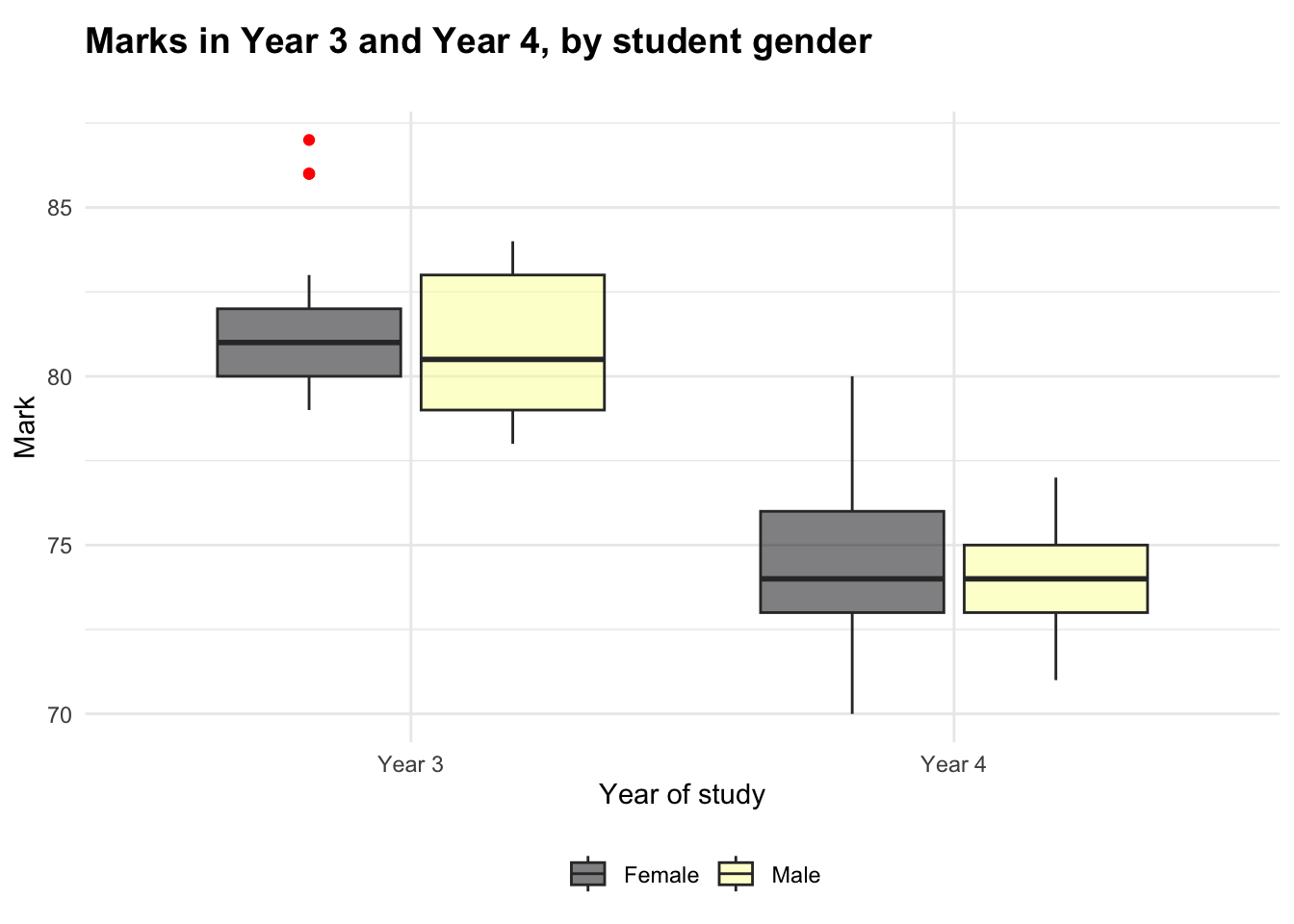
The boxplot suggests that there is a small amount of variation between the genders for marks in Year 3, but there does not appear to be a notable difference in Year 4.
Two other observations that can be made from the boxplot are:
- The spread of marks appears to vary between the genders (more than the mean varies). This could indicate an area for future investigation.
- There appear to be two outliers. The code chunk below outputs the dataframe filtered to show only outliers ± three standard deviations from the mean. As the output is empty, this shows that the mild outliers are within three SDs of the mean; considering that there is likely to be a natural variation in marks, and it is not outside the norm for a student or small group of students to achieve higher marks, I will not remove these outliers arbitrarily.
I decided to use a threshold of 3 standard deviations from the mean to detect outliers, as this is considered best practice when highlighting extreme values without being overly strict (Tharaka, 2025).
mean_y3 <- mean(df$year3, na.rm = TRUE) #get mean of year3
sd_y3 <- sd(df$year3, na.rm = TRUE) #get SD of year3

df %>%
  filter(year3 > mean_y3 + 3* sd_y3 | year3 < mean_y3 - 3* sd_y3) #show any outliers ± 3 SDs from mean
# A tibble: 0 × 12
# ℹ 12 variables: id <dbl>, gender <fct>, age <dbl>, pment <fct>,
# language <dbl>, feedback <dbl>, year1 <dbl>, year2 <dbl>, year3 <dbl>,
# year4 <dbl>, employ <fct>, age_combined <fct>Hypothesis tests
The null hypotheses are:
\(H_0: \mu_{M3} = \mu_{F3}\)
\(H_0: \mu_{M4} = \mu_{F4}\)
(There is no difference between marks for males and females in Year 3 nor in Year 4).
t.test(df$year3 ~ df$gender, var.equal = TRUE) #run t-test for year3
    Two Sample t-test

data:  df$year3 by df$gender
t = 1.5508, df = 46, p-value = 0.1278
alternative hypothesis: true difference in means between group Female and group Male is not equal to 0
95 percent confidence interval:
 -0.28866  2.22616
sample estimates:
mean in group Female   mean in group Male
81.71875 80.75000 t.test(df$year4 ~ df$gender, var.equal = TRUE) #run t-test for year4
    Two Sample t-test

data:  df$year4 by df$gender
t = 0.76668, df = 47, p-value = 0.4471
alternative hypothesis: true difference in means between group Female and group Male is not equal to 0
95 percent confidence interval:
 -0.7492945  1.6720886
sample estimates:
mean in group Female   mean in group Male
            74.34375             73.88235
Interpreting the hypothesis tests
Two two-sample t-tests were conducted to explore differences between the genders for the Year 4 marks awarded and the Year 3 marks awarded. Neither test found a statistically significant difference between the genders in Year 3 (p = 0.128) or Year 4 (p = 0.447) at a 5% significance level.
As such, we fail to reject the null hypotheses. The mean difference between the genders in Year 3 was approximately 0.97 marks with a 95% confidence interval ranging from -0.29 to 2.23. For Year 4, the mean difference was 0.46 marks with a confidence interval of -0.75 to 1.67. As the confidence intervals both include zero, this is further reinforcement that there is no statistically significant difference that can be reported.
These results suggest that there are not meaningful differences between the genders in the population of students at Year 3 and Year 4 of study. I could, however, recommend to the Head of School that the different spread of marks between genders could warrant further exploration, as could the notable decrease in mean marks from Year 3 to Year 4, which will be investigated in Research Question 2.
Considerations
It is important to remember the following:
- Having excluded observations with missing data, the t-tests were run on small samples (n = 48 for
year3and n = 49 foryear4). This can increase the risk of a Type II error as it makes it more difficult to identify true differences between the data. - To meet the requirements of the question two hypothesis tests were run, but it is important to acknowledge the increased risk of Type I errors that can be associated with multiple testing.
- The balance of genders represented in the sample is uneven, with twice as many females represented as males. This could affect the partiality of the findings, so a more balanced dataset could be used in future to lower the risk of bias.
- As noted above, the data in
year3andyear4does appear normally distributed based on the histograms, but with a potential group of higher-performing students (particularly inyear3). This could be explored further as the outliers were also only observed in the female category.
Research Question 2: Is there a statistically significant difference between the average mark in year 4 and the average mark in year 3?
You will observe that ‘Year4’ has some missing observations and ‘Year3’ has some missing observations, this results in some paired observations and some unpaired observations, we often refer to this scenario as partially overlapping samples (Derrick, 2017). The R package ‘Partiallyoverlapping’ can be used ‘for comparison of means using the partially overlapping t-test, for two samples each with paired and unpaired observations.’
Installing and exploring the package
I will install, load and query the package, before commenting out these commands to prevent confusion later.
#install.packages("Partiallyoverlapping")
#library(Partiallyoverlapping)
#??Partiallyoverlapping
Running a partially overlapping samples t-test
I will use the year3 and year4 variables from the dataset to carry out the test - thereby exploring whether there is a statistically significant difference between the average marks in Year 3 and Year 4.
Partover.test(x1 = df$year3,
              x2 = df$year4,
              stacked = TRUE) #indicates that one vector is used for each sample (combining both paired and independent observations)
$statistic
[1] 22.52904
$parameter
[1] 48.76027
$p.value
[1] 0.000000000000000000000000001989351
$estimate
[1] 7.21216Interpreting the test
Because the relevant variables contain both paired and unpaired observations, I ran Partover.test to compare the marks between year3 and year4. The test indicates that there is a statistically significant difference between the marks; the output shows a t-statistic of 22.53 and a p-value far below the 5% significance level.
The test outputs an estimated difference of 7.21, indicating that the mean of year3 is approximately 7.21 marks higher than the mean of year4 - so the average student achieves higher marks in Year 3 than in Year 4. This reinforces the observation from the boxplot in RQ1, which visualised a decrease in marks from Year 3 to Year 4.
As this finding is statistically significant, it should be reported to the Head of School as it may suggest that Year 4 is more difficult or stressful for students. Further exploration could be carried out, to investigate the reasons for the decrease in marks - for example, students struggling to re-engage with academia following their return from placement year.
Research Question 3: Can the Year 4 mark be predicted by the marks awarded for the other three years?
Exploring the relationships between years
First, I will assign the marks from each year to a new variable, df_yrs.
df_yrs<- df %>%
  dplyr::select(c("year1", "year2", "year3", "year4")) #select only relevant variables (i.e. marks from each year)
To investigate the extent to which the Year 4 mark can be predicted by the marks from other years, it is necessary to confirm that the relationships between these variables are linear. I will produce a simple pairplot to visualise these relationships and begin the process of confirming linearity.
plot(df_yrs) #plot all years against one another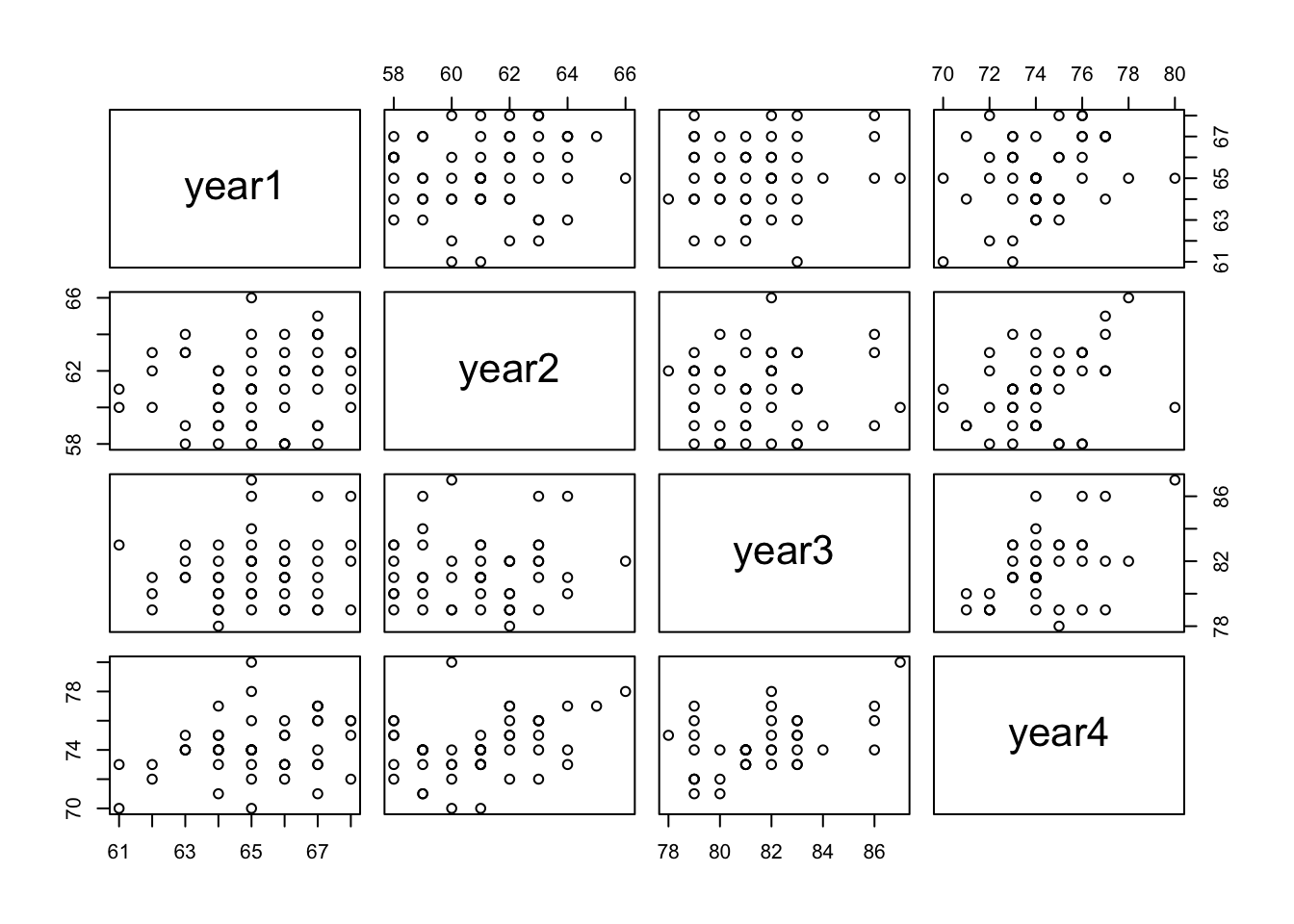
Although some of the scatterplots suggest only a negligible correlation between variables (e.g. year1 and year2), there does appear to be a roughly linear relationship between year4 (the dependent variable) and each of the other years at a first glance. To formalise my understanding of these relationships, I will produce a heatmap with Pearson’s coefficients to both quantify and visualise any correlations.
corrs <- cor(df_yrs, use = "pairwise.complete.obs") #get r-values (only for pairs of observations where neither value is NA)
corrplot(corrs, method="number") #plot variables together in a correlation matrix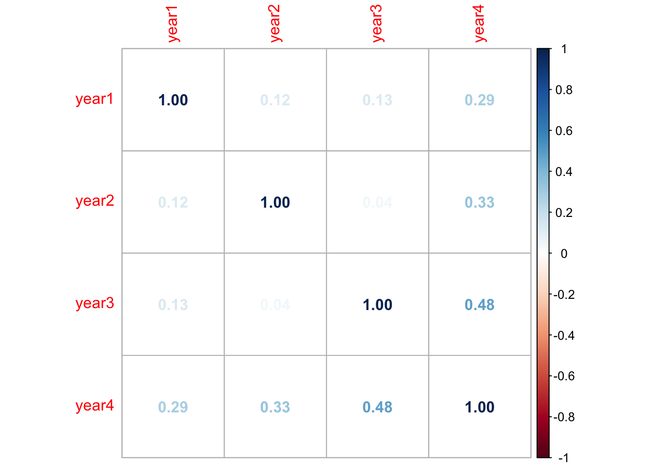
Fitting the multiple linear regression model
Full model
To fit my model, first I will build a model with all variables: year4 as the outcome variable and year1, year2, and year3 as the predictors.
full_model <- lm(year4 ~ ., data = df_yrs) #build model with all variables
summary(full_model) #summarise model
Call:
lm(formula = year4 ~ ., data = df_yrs)

Residuals:
    Min      1Q  Median      3Q     Max
-2.1656 -1.1934 -0.2674  0.8570  3.8021

Coefficients:
            Estimate Std. Error t value Pr(>|t|)
(Intercept)  13.0210    14.2187   0.916  0.36588
year1         0.1776     0.1455   1.221  0.23006
year2         0.3012     0.1314   2.293  0.02781 *
year3         0.3858     0.1163   3.318  0.00208 **
---
Signif. codes:  0 '***' 0.001 '**' 0.01 '*' 0.05 '.' 0.1 ' ' 1

Residual standard error: 1.569 on 36 degrees of freedom
  (20 observations deleted due to missingness)
Multiple R-squared:  0.3627,    Adjusted R-squared:  0.3096
F-statistic: 6.829 on 3 and 36 DF,  p-value: 0.0009247
This model can predict 36.27% of the variability in Year 4 marks, suggesting that the combined three years preceding year4 have moderate predictive power. This is statistically significant with a p-value much lower than 0.05.
To investigate further, as year1 and year2 are only weakly correlated with year4 (r = 0.29 and r = 0.33 respectively), I will explore whether removing them improves the model’s performance.
Finding the best fit
best_model <- stepAIC(full_model) #using the stepwise function to fit the best fit for the modelStart: AIC=39.83
year4 ~ year1 + year2 + year3
Df Sum of Sq RSS AIC
- year1 1 3.6706 92.321 39.456
<none> 88.651 39.833
- year2 1 12.9443 101.595 43.285
- year3 1 27.1120 115.763 48.506
Step: AIC=39.46
year4 ~ year2 + year3
Df Sum of Sq RSS AIC
<none> 92.321 39.456
- year2 1 14.072 106.393 43.130
- year3 1 30.204 122.525 48.778The output of the stepAIC() function indicates that the model with the best fit is year4 ~ year2 + year3. I will compare the Akaike Information Criteria of these models to confirm this.
The lower AIC value (39.46) indicates that best_model has a very slightly better fit for predicting marks in Year 4 than full_model (39.83), although the difference is not substantial so may not be particularly meaningful in practice.
Checking the assumptions of the model
I will use the check_model() function to assess the quality of the fit of the model and how well it meets the assumptions of linear regression.
check_model(best_model) #run diagnostics to confirm model fit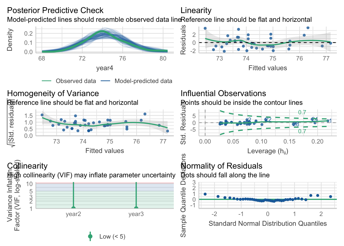
The diagnostics do not indicate that I should be concerned about assumption violations. The residuals are reasonably normally distributed with evidence of homoscedasticity and minimal evidence of multicollinearity. As such, the linear model appears to be a good fit for the data.
Interpreting the model
To summarise, my multiple linear regression modelling suggests that marks from Year 1 to Year 3 are somewhat positively associated with marks in Year 4. The strongest lone predictor is Year 3, although this should be approached with some caution as the r-value is only moderately strong (r = 0.48).
summary(best_model)$r.squared #get r-squared from final model[1] 0.3362965The model explains approximately 33.63% of the variance in Year 4 marks. This can be relatively useful to the Head of School, as it suggests that earlier academic performance may go some way to predicting the marks received in Year 4. Further analysis would be required to build a more comprehensive model to explain Year 4 outcomes, but this exploration can be used as a starting point to consider how to best support students. For example, if a student’s marks in Year 2 are noted to be lower, then this model suggests that some additional support could help them to increase their grades in Year 3, in turn ultimately improving their chances of a better mark in Year 4.
Your Research Question: Report
Clearly state one research question based on the data set supplied to you. This may be an extension to the research questions considered above, or a new research question making use of the available data. Explain why this is a worthwhile new research question or extension to consider. You are required to write a short report for the client showing your analyses of the data set provided, based only on the research question or extension you have selected.
Introduction
This report will investigate the research question: is there a relationship between students’ pre-course English language proficiency, and post-course employment outcomes?
This is a useful question to explore as it could reveal a connection between English language skills and employment - potentially a need for support to improve students’ employability prospects.
Methodology
The first step of the analysis is to produce a combination violin-and-boxplot. This is useful to visualise the distribution of language scores for each post-course employment outcome. Please note, employ is a categorical variable and language is similar to a Likert scale but for the purposes of this analysis, can be treated as a numerical scale (Mangiafico, 2016).
Output 1: violin plot
ggplot(df, aes(x = language,
               y = employ, #add variables to plot
               fill = employ)) +
  geom_violin(trim = FALSE,
              alpha = 0.6) + #build violins
  geom_boxplot(outlier.colour = "red",
               na.rm = TRUE, #build internal boxplots
               width = 0.2,
               fill = "white") +
  theme_minimal() +
  scale_fill_viridis(discrete = TRUE,
                     alpha=0.6,
                     option = "B",
                     labels = c("E1" = "Employed", "E2" = "In full-time further education", "U" = "Not yet employed")) + #edit colour palette, labels etc
  theme(legend.position="bottom",
        plot.title = element_text(size = 14,
                                  face = "bold",
                                  margin = margin(t = 5, b = 20))) +
  labs(title = "Language scores for each post-course outcome", #create labels and title
       x = "Language score",
       y = " ",
       fill = "Outcome: ")
Warning: Removed 5 rows containing non-finite outside the scale range
(`stat_ydensity()`).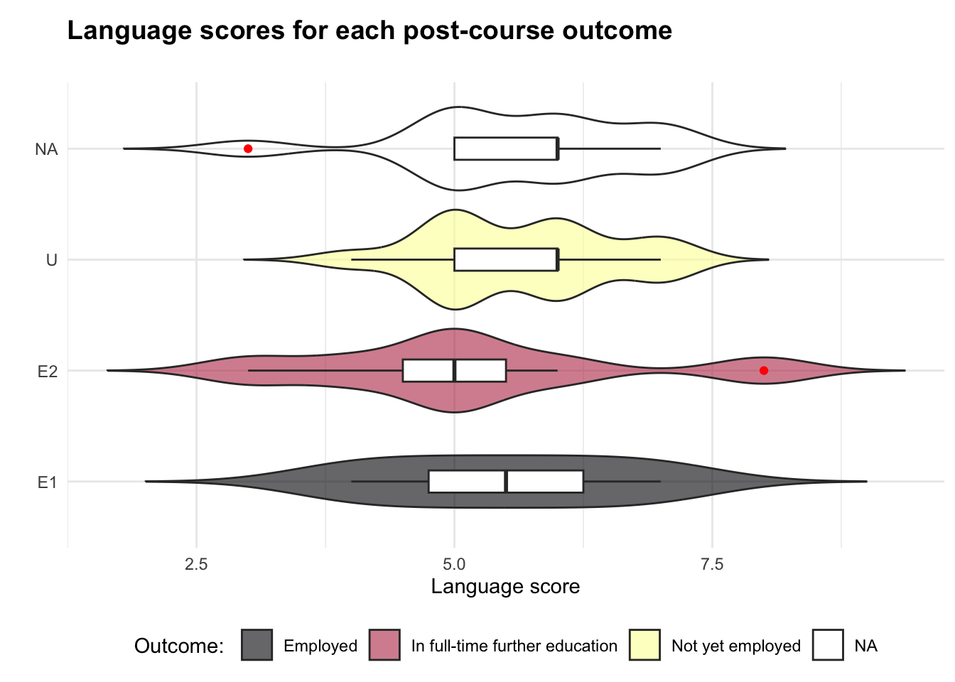
The plot shows that the data may not follow a normal distribution - if it was normal, the top of each of the coloured shapes would resemble a “bell curve”. The fact that there is a shape labelled “NA” also means that there is some data missing, which can negatively impact on our analysis.
As such, the statistical test that is chosen for this analysis is a bootstrapped ANOVA - a way of effectively testing a numerical scale (like language score) in respect of categories (like employment outcomes), even when sample size is relatively small and not following a bell curve. The results of this test will be an “f-statistic” and a “p-value”, which quantify whether there is a relationship between students’ language scores and employment outcomes.
Output 2: the bootstrapped ANOVA test
df_bs <- df %>%
  filter(!is.na(language), !is.na(employ)) #filter data to hide language/employ NAs

set.seed(643) #set seed for reproducibility
n_bootstraps <- 4000

boot_f <- rep(NA, n_bootstraps) #initialise variable with one NA per bootstrap

n <- nrow(df_bs) #set n to number of instances in filtered dataframe

for(i in seq_len(n_bootstraps)){ #loop length of n_bootstraps
  boot_sample <- df_bs[sample(n, replace = TRUE), ]  #sample rows (wth replacement)
  boot_model <- aov(language ~ employ, data = boot_sample)  #run anova
  boot_f[i] <- summary(boot_model)[[1]]$`F value`[1]  #get f-statistic
}

quantile(boot_f, c(0.025, 0.975))  #get confidence intervals for f-statistic
2.5% 97.5%
0.04700821 8.86431403 Key findings
At the bottom of Output 2 are the “confidence intervals” - we can be 95% confident that the f-statistic falls between 0.047 and 8.864. The higher the f-statistic, the more evidence for a significant relationship between students’ language scores and employment outcomes. With a range of 8.8, the f-statistic is not immediately interpretable, so we should be cautious about drawing conclusions (Bobbitt, 2021). To add more certainty, we next check the p-value.
Output 3: the p-value
obs_f <- summary(boot_model)[[1]]$`F value`[1]
p_boot <- mean(boot_f >= obs_f) #get p-value from anova results
p_boot
[1] 0.107The p-value is not what we would interpret as statistically significant (less than 0.05), so we cannot say that there is evidence for a link between language score and post-course outcomes.
Interpretation
Although there may seem to be a difference between language scores in the violinplot, we cannot conclude that pre-course English proficiency is a reliable predictor of post-course employment. We would recommend to the Head of School that providing language support for students might not be the highest priority, and further research could investigate which variables are more strongly linked to employment outcomes.
Limitations
The analysis was limited by its small sample size and missing data. Future analysis could consider other factors that may play a role in a student’s employability prospects, such as career advice, socioeconomic background, or engagement with their placement year.
Conclusion
In conclusion, no statistically significant relationship was found between language proficiency and employment outcome in this data, suggesting that language may not be an important factor in post-course employability and indicating that other stronger links may exist.1
References
Bobbitt, Z. (2021) How to Interpret the F-Value and P-Value in ANOVA [blog]. Available from: https://www.statology.org/anova-f-value-p-value/ [Accessed 19 May 2025].
Bobbitt, Z. (2022) How to Use pivot_longer() in R [blog]. Available from: https://www.statology.org/pivot_longer-in-r/ [Accessed 16 May 2025].
Derrick, B. (2017). Partiallyoverlapping: Partially overlapping samples t-tests. R package for calculating the partially overlapping samples t-test (version 2)
Ebner, J. (2021) How to use the R case_when function [blog]. Available from: https://sharpsight.ai/blog/case-when-r/ [Accessed 3 May 2025].
Kaur, T. (2025) The Impact of Missing Data on Statistical Analysis and How to Fix It [blog]. Available from: https://medium.com/@tarangds/the-impact-of-missing-data-on-statistical-analysis-and-how-to-fix-it-3498ad084bfe [Accessed 19 May 2025].
Mangiafico, S. (2016) Introduction to Likert Data. Summary and Analysis of Extension Program Evaluation in R [online]. Available from: https://rcompanion.org/handbook/E_01.html [Accessed 19 May 2025].
Tharaka, S. (2025) Z-Score Outlier Detection Explained: How to Identify Anomalies in Your Data? [blog] Available from: https://www.mlinsightful.com/z-score-outlier-detection-explained/ [Accessed 27 April 2025].
Tüzen, M. (2024) Cracking the Code of Categorical Data: A Guide to Factors in R [blog]. Available from: https://www.r-bloggers.com/2024/01/cracking-the-code-of-categorical-data-a-guide-to-factors-in-r/ [Accessed 10 May 2025].
End matter - Session Information
sessionInfo()R version 4.4.2 (2024-10-31)
Platform: aarch64-apple-darwin20
Running under: macOS Sequoia 15.5
Matrix products: default
BLAS: /Library/Frameworks/R.framework/Versions/4.4-arm64/Resources/lib/libRblas.0.dylib
LAPACK: /Library/Frameworks/R.framework/Versions/4.4-arm64/Resources/lib/libRlapack.dylib; LAPACK version 3.12.0
locale:
[1] en_US.UTF-8/en_US.UTF-8/en_US.UTF-8/C/en_US.UTF-8/en_US.UTF-8
time zone: Europe/London
tzcode source: internal
attached base packages:
[1] stats graphics grDevices utils datasets methods base
other attached packages:
[1] Partiallyoverlapping_2.0 MASS_7.3-65 corrplot_0.95
[4] performance_0.13.0 moments_0.14.1 viridis_0.6.5
[7] viridisLite_0.4.2 assertr_3.0.1 janitor_2.2.1
[10] lubridate_1.9.4 forcats_1.0.0 stringr_1.5.1
[13] dplyr_1.1.4 purrr_1.0.2 readr_2.1.5
[16] tidyr_1.3.1 tibble_3.2.1 ggplot2_3.5.1
[19] tidyverse_2.0.0
loaded via a namespace (and not attached):
[1] gtable_0.3.6 xfun_0.50 bayestestR_0.15.2 htmlwidgets_1.6.4
[5] insight_1.1.0 lattice_0.22-6 tzdb_0.4.0 vctrs_0.6.5
[9] tools_4.4.2 generics_0.1.3 parallel_4.4.2 datawizard_1.0.1
[13] pkgconfig_2.0.3 Matrix_1.7-1 lifecycle_1.0.4 compiler_4.4.2
[17] farver_2.1.2 munsell_0.5.1 snakecase_0.11.1 htmltools_0.5.8.1
[21] yaml_2.3.10 pillar_1.10.1 crayon_1.5.3 nlme_3.1-166
[25] tidyselect_1.2.1 digest_0.6.37 stringi_1.8.4 labeling_0.4.3
[29] splines_4.4.2 fastmap_1.2.0 grid_4.4.2 colorspace_2.1-1
[33] cli_3.6.3 magrittr_2.0.3 patchwork_1.3.0 withr_3.0.2
[37] scales_1.3.0 bit64_4.6.0-1 timechange_0.3.0 rmarkdown_2.29
[41] bit_4.5.0.1 gridExtra_2.3 hms_1.1.3 evaluate_1.0.3
[45] knitr_1.49 mgcv_1.9-1 rlang_1.1.5 glue_1.8.0
[49] rstudioapi_0.17.1 vroom_1.6.5 see_0.11.0 jsonlite_1.8.9
[53] R6_2.5.1 Footnotes
Word count: 499↩︎